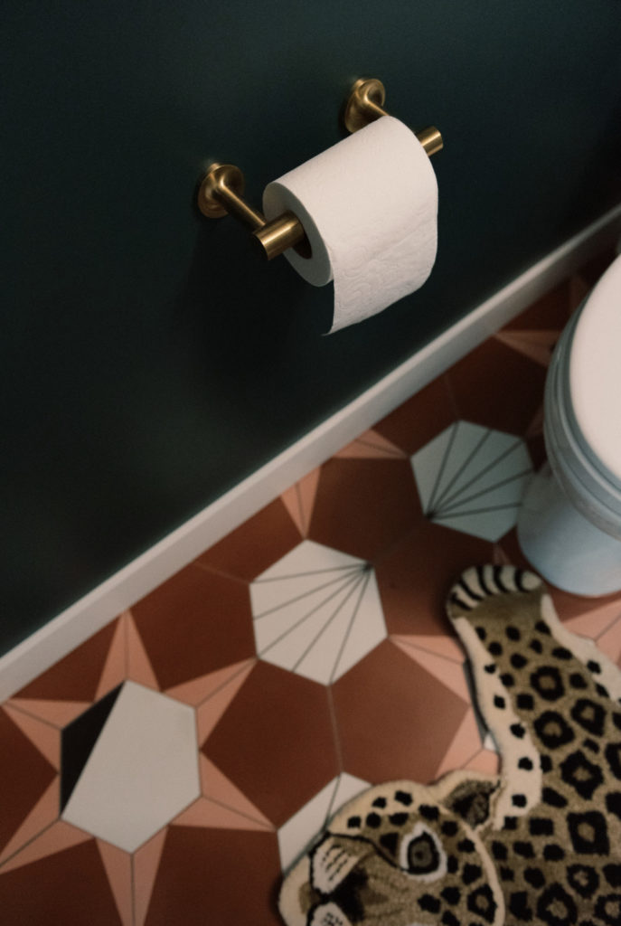
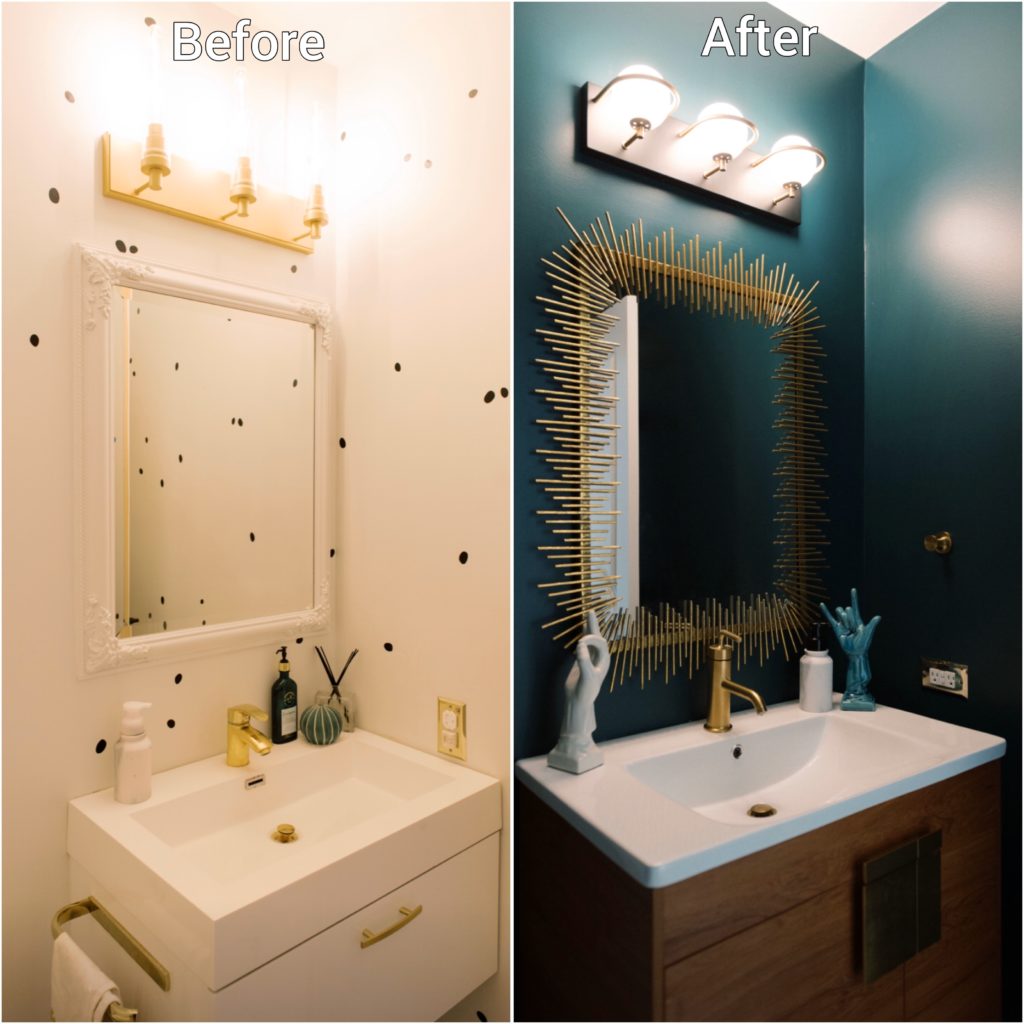
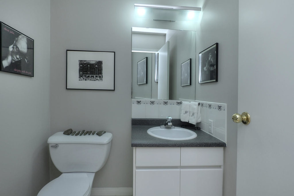
We are so excited to finally share this space with you. And with everyone’s extra time at home maybe it’ll inspire you to tackle a home project too! First off, I know what you may be thinking my “before” photos don’t look that bad. When we first moved into this home, we quickly updated this bathroom from it’s previous 90’s glory. (See one image of what this space looked like when we first moved in) We had tons of other projects on the go with the house and we just needed this space to function quickly. We learned ALOT from this bathroom’s first minor facelift. What you can’t see are those tiny dots on the wall are covering up holes and imperfections throughout the room. The white floor that was beyond stained, even a professional cleaner couldn’t figure it out how to clean that tile. The floor tile was like a dirty white golf ball with tiny divots and never meant to be installed on the ground. And on top pf it, a sink that wouldn’t drain within only a few months of installing it! Did I mention this is our main floor bathroom, the one all our guests see and use? So when Wayfair and Kohler asked if we would partner with them to renovate this space, we were so excited for the opportunity to get some design choices right this time. Welcome to our new powder room with a Palm Springs vibe!
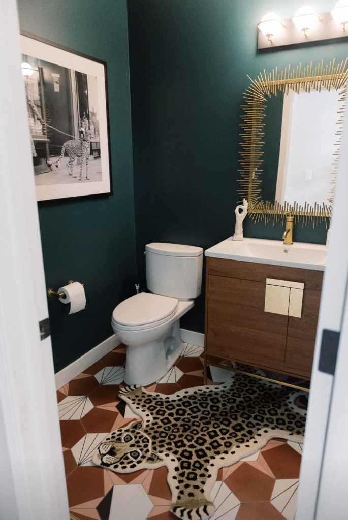
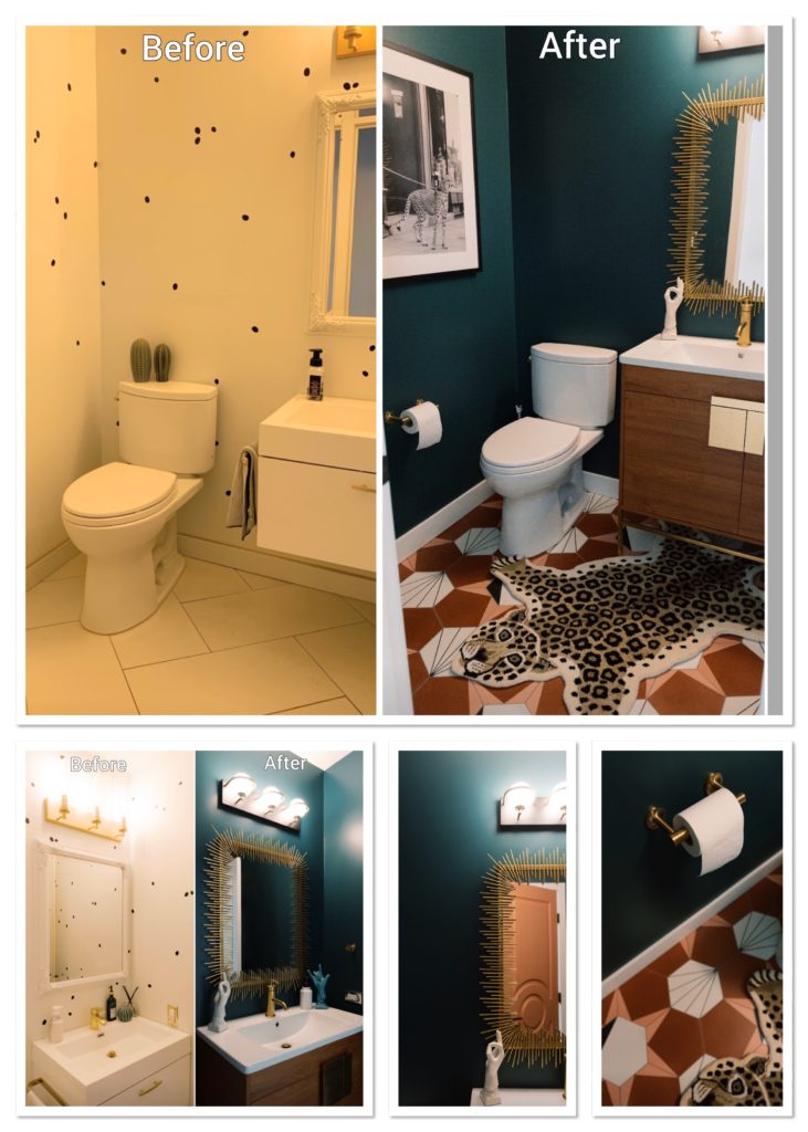
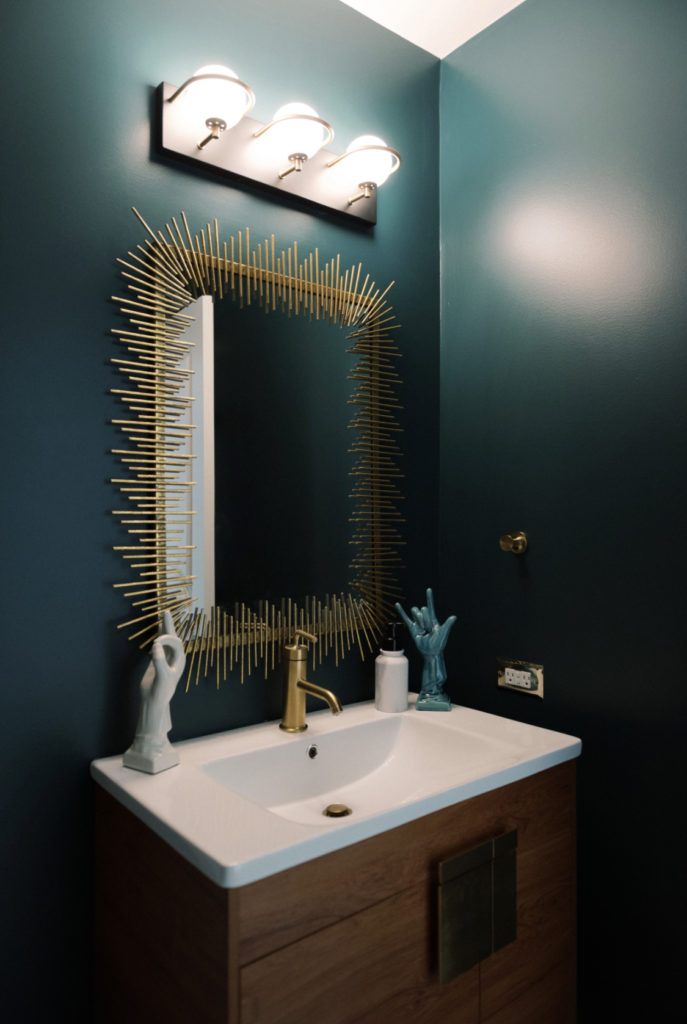
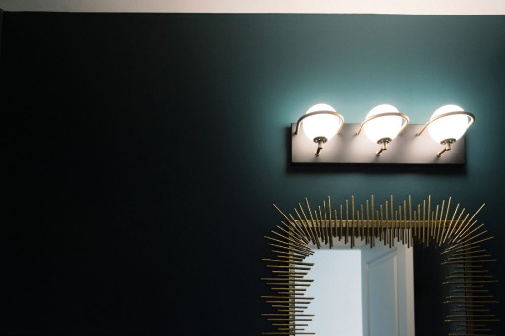

The lighting is dimmer than you would see in a full bath. Because this room is a powder room only and will not be a bathroom we use to get ready we didn’t need to install bright task lighting. I love the moody dramatic feel this level of light gives to the space. Enough for lipstick touch ups in the mirror but not blinding when standing at the vanity.
